
Launching a Category-Defining Wood Brand
Emberline Wood was born from opportunity, but opportunity without positioning is just product.
A new thermally modified wood line backed by deep industry expertise needed more than a logo. It needed a brand architecture. A point of view. A reason to exist in a category crowded with technical claims and commodity messaging.
Our role was to build the foundation (strategically, visually, and commercially) so Emberline could launch with authority.
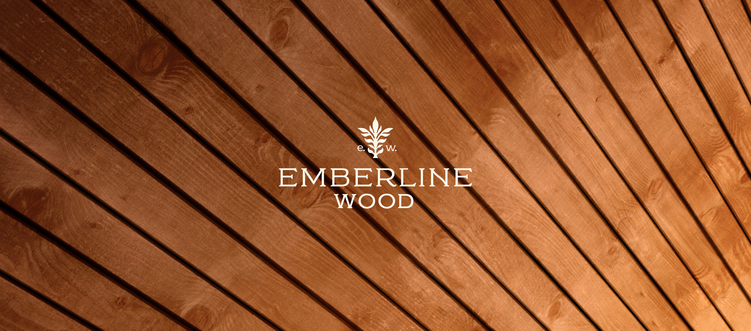
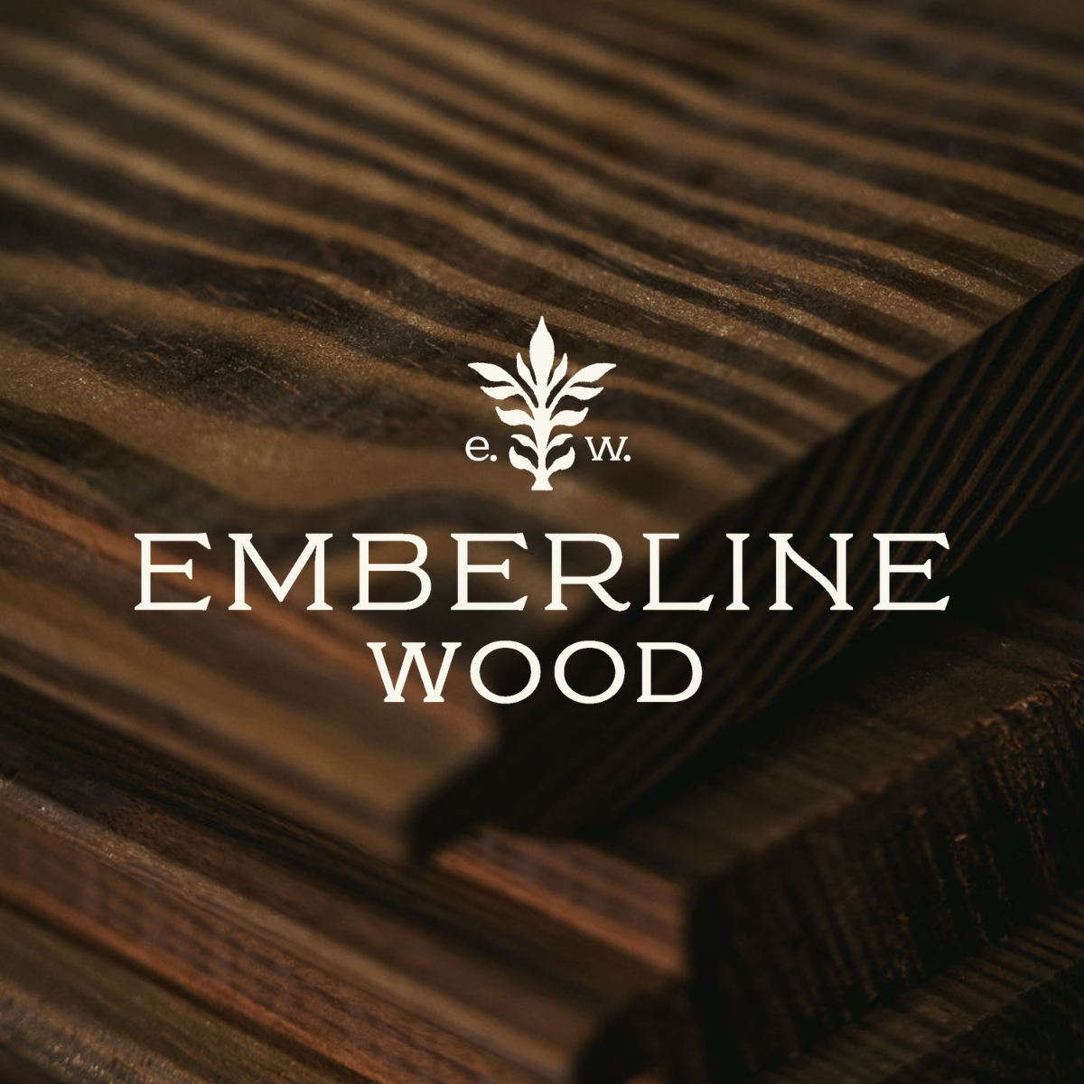
Emberline Wood is a premium line of thermally modified hardwoods designed for architectural applications. Backed by seasoned operators with decades of millwork and building expertise, the product performance was real. The craftsmanship was real.
What didn’t exist yet was the brand.
This wasn’t a refresh. It was a ground-up build.

The Challenge:
Thermally modified wood is a growing category, but it’s often explained in engineering language, not brand language.
We had to:
Clarify what makes thermally modified wood valuable without sounding technical or academic
Differentiate Emberline Wood from both commodity lumber and other thermo suppliers
Establish credibility quickly in front of architects, builders, and distributors
Build a scalable identity system that could live across print, digital, trade shows, and sales collateral
Align the brand with a premium price point, both visually and verbally
And we had to do it in a way that felt timeless, not trendy.
Our Approach:
We started where we always do: with positioning.
Before a single design element was created, we defined what Emberline Wood needed to stand for. This wasn’t just thermally modified wood. It was wood refined by fire, engineered for performance and elevated for architectural design. That distinction mattered. In a category crowded with technical specs and commodity claims, Emberline Wood needed a clear lane.
We positioned the brand at the intersection of architectural credibility, material innovation, and refined craftsmanship. The tone wasn’t loud. It didn’t need to be. The product carried weight. The brand simply needed to match it: performance without noise, confidence without overstatement.
From there, we built an identity system that could carry that positioning into the real world. Every element, from the messaging framework to the typography, from the color palette to the species storytelling, reinforced the same idea—this is specification-grade material. Not lumber. Not a trend. A considered architectural choice.
Sales collateral, trade show messaging, and digital direction were developed with scale in mind. The brand had to feel established on day one and expandable on day one hundred.
At the same time, we balanced precision with aspiration. Architects need performance data. Developers need durability. Builders need workability. But decisions at this level are never purely technical.
So we created a messaging system that speaks to both sides of the equation: dimensional stability and design integrity, sustainability and aesthetic character. Performance leads the conversation. Design gives it staying power.
The result is a brand that doesn’t just explain the product. It elevates it
The Outcome:
Emberline Wood launched with clarity and presence.
A distinct voice in a technical category.
A premium visual identity aligned with a premium product.
Sales materials built to support distributor conversations.
A brand system designed to scale with the business.
Instead of entering the market as “another thermo supplier,” Emberline entered as a refined architectural material brand.
Grounded in performance.
Elevated in presentation.
Built for long-term growth.